Tuesday 18 February 2014

Illustrator Drawing


A) I chose PNG because it has a high resolution and lossless compression, meaning it that is discards no information when it's compressed.

Link to the file format reference website

B) I lowered the opacity of the original image and created a new layer with full opacity on top of it. I selected colours as similar to the original as I could and put the 'Gaussian Blur' effect on many of the strokes to help blend the image.

C) I couldn't find a blur tool so I applied the blur effect to each individual stroke for a similar look.


D) I have mixed feelings about the final result. I think it looks nicely blended but at the same time, it's too blurry when the original image is much sharper.


Thursday 6 February 2014

Pixel Portrait

(PNG)
(GIF)
a) The GIF has sharper edges, the PNG is more blended and smooth. The GIF is crisper.

b) I was attempting to accentuate the hair and colour plays a crucial part in this because the blue is what makes it stand out.

c) I put the photograph under the layer I drew on. I used the eyedropper tool to get accurate colours to draw with. I used the blur tool to smooth the edges that I didn't want to be sharp.

Wednesday 22 January 2014

Digital Surrealism


The knives represent insulting words that can leave emotional scars as a real knife would leave physical ones. The message is that words can impact someone a lot more than you may think.

I drew some knives in various positions aimed at silhouettes of people in various positions. I photographed myself in front of a white background and got pictures of knives from the internet. I turned up the threshold and contrast on the picture of me to make it a silhouette, then I coloured any remaining bits black with the brush tool. I changed the knives colours to colours that correspond with colours on an album that has lyrics that this was roughly inspired by ("these words are knives that often leave scars" - This Is Gospel by Panic! At The Disco).


I am somewhat satisfied with my end result. It's what I had in mind but there's a lot of empty space at the top and I think it's a bit too simple. I learned how to make silhouettes.

Thursday 12 December 2013

Narrative Painting Research

Artist: Kerstin Bratsch
Title: Blocked Radiant C
Date: 2011
Medium: Oil on paper
Dimensions: 110 x 72"
This caught my eye because its combining and layering various ideas and shapes and colours into one painting, which is what I'm hoping to do with my narrative. I especially like the orange and occasionally blue highlights on the black figures.


Artist: R. H. Quaytman
Title: iamb (The Limbo of Vanity)
Date: 2008
Medium: Oil, Silkscreen ink, Gesso on wood
Dimensions: 32 3/8 x 52 3/8"

I like this piece of art because it also uses layering and various mediums to create a whole. It's pretty and interesting to look at, yet it's simple. It also demonstrates that you don't need a bunch of colours to create a powerful painting.


Artist: Elizabeth Murray
Title: Do the Dance
Date: 2005
Medium: Oil on canvas on wood
Dimensions: 9' 5" x 11' 3"


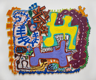
I really like this piece of art because of the bold shapes and colours. It's using an almost cartoon-like style to deliver a message, which I think is a really interesting idea.


Wednesday 27 November 2013

Principles of Animation (5-8)

5. FOLLOW THROUGH AND OVERLAPPING ACTION

The follow through is when the smaller parts of a subject catch up to it's main mass. Parts like long hair, coat tails, capes, long tails, etc. follow through. The overlapping action is when the smaller parts of a subject take a few frames longer to change direction after the main mass does.

6. SLOW-OUT AND SLOW-IN

Fewer frames increase speed and more frames decrease the speed. Adding extra frames at the beginning and end of an action make the action ease in and ease out, softening it and making it more life-like.

7. ARCS

Almost all actions follow a slightly circular path, especially among humans and animals. Arcs exist to give animation a more natural and fluid motion.

8. SECONDARY ACTION
The secondary action reinforces and enriches the main actions. It can further express mood.
For example if a character is angrily walking, the secondary action would be arms swinging forcefully.