Thursday, 12 December 2013

Narrative Painting Research

Artist: Kerstin Bratsch
Title: Blocked Radiant C
Date: 2011
Medium: Oil on paper
Dimensions: 110 x 72"
This caught my eye because its combining and layering various ideas and shapes and colours into one painting, which is what I'm hoping to do with my narrative. I especially like the orange and occasionally blue highlights on the black figures.


Artist: R. H. Quaytman
Title: iamb (The Limbo of Vanity)
Date: 2008
Medium: Oil, Silkscreen ink, Gesso on wood
Dimensions: 32 3/8 x 52 3/8"

I like this piece of art because it also uses layering and various mediums to create a whole. It's pretty and interesting to look at, yet it's simple. It also demonstrates that you don't need a bunch of colours to create a powerful painting.


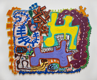
Artist: Elizabeth Murray
Title: Do the Dance
Date: 2005
Medium: Oil on canvas on wood
Dimensions: 9' 5" x 11' 3"


I really like this piece of art because of the bold shapes and colours. It's using an almost cartoon-like style to deliver a message, which I think is a really interesting idea.




Wednesday, 27 November 2013

Principles of Animation (5-8)

5. FOLLOW THROUGH AND OVERLAPPING ACTION

The follow through is when the smaller parts of a subject catch up to it's main mass. Parts like long hair, coat tails, capes, long tails, etc. follow through. The overlapping action is when the smaller parts of a subject take a few frames longer to change direction after the main mass does.

6. SLOW-OUT AND SLOW-IN

Fewer frames increase speed and more frames decrease the speed. Adding extra frames at the beginning and end of an action make the action ease in and ease out, softening it and making it more life-like.

7. ARCS

Almost all actions follow a slightly circular path, especially among humans and animals. Arcs exist to give animation a more natural and fluid motion.

8. SECONDARY ACTION
The secondary action reinforces and enriches the main actions. It can further express mood.
For example if a character is angrily walking, the secondary action would be arms swinging forcefully. 

Friday, 18 October 2013

Kira Chess Piece

I mentally divided the chess piece into thirds to ensure  that the proportions are accurate. I did a lot of lightly drawing the chess piece and my hand while only looking at the subject (no looking at the paper) because I tend to get more accurate curves that way. I drew the value by placing the chess piece on one side of a light then drawing it. I added value to the chess piece by looking at it as a collection of lights and darks instead of a complete object so that I don't make up any value in my head. I lightly shaded with the lightest pencil (HB) first, then I added the 2B, and finally the 6B to areas that needed it. 

I created pattern by repeating similar lines in the background. I created movement by making all the lines point to the chess piece by getting thinner and lighter as they reach the chess piece.

The composition is not in the centre to add interest and complexity to the drawing. I chose it's exact position by following the rule of thirds. To maintain balance, I added a hand holding the chess piece that takes up the right side. 

I made the chess piece the focal point by having all lines point towards it. The two fingers are on either end of it so your eyes look from top to bottom of the chess piece. The ball of the chess piece is directly on the rule of thirds.

Friday, 27 September 2013

Logo Assignment


1. Where did you begin? 
I think of creative ideas quickly, and I can execute them fairy quickly at a high work quality. Cheetahs are more creative and resourceful than most animals in terms of survival skills such as catching prey. They're also the fastest known animal.


2. Elements and Principles. 
I chose this position for the cheetah because it's defined, and it captures the cheetah doing what it's known best for, which is running. It will therefore be easily recognized as a cheetah. I chose the green to blue gradient because blue captures me (calm and creative) and the green captures the cheetah (natural and vibrant). The gradient is an artistic method of combining the cheetah and myself. I don't find the colours necessary to deliver the message of my logo (that if you hire me you will be hiring a creative and efficient worker) because the main aspect of this logo is the shape. For this reason, I don't mind that the grayscale takes away the turquoise gradient, since the overall shape is still present. I kept the line quality simple because the shape itself is complex. I didn't add any typography because I like the simple look of my logo and I think the shape is strong enough to stand alone.


3. Get technical.
I started off by searching google images for a cartoon of a cheetah mid-run. I chose cartoon instead of an actual image to simplify the tracing process. Next, I brought the image into illustrator and added a new layer, dimmed the opacity of the cheetah and started tracing using the pen tool. Once the tracing was finished, I hid the original image and smoothed over many of the edges of the cheetah. Then I filled in the traced cheetah with a green to blue gradient. 

4. Your thoughts and opinion.
I am happy with my logo and how it turned out. I may have made the green lighter and the blue darker to increased the effect of the gradient in grayscale. I still don't mind it's current look in grayscale though. I learned that with logos, simplicity is key. I would like to make a logo made of only typography sometime.

"The Kitchenmaid" analysis by Kira


The Kitchenmaid by Vermeer
Analysis by Kira Chalykoff
Imitationalism
Vermeer’s “The Kitchenmaid” would get a 9/10 for imitationalism. This painting looks exactly like real life. The painting is covered in precise and accurate details. The shading and texture are done so well that this painting could be mistaken for a real life image. The shadowing in the bottom and top left corners look exactly like it would if I were actually standing in that room. The texture on the clothes increases this realistic effect. The only aspect that seems a bit unrealistic is the level of saturation and contrast. I think the contrast and saturation were increased to make the painting more visually interesting. This painting does look like real life.

Formalism
I would assign this painting an 8/10 for its use of the elements and principles of design. Some elements and principles that it uses very well are contrast, texture, proportion, emphasis, and value. It uses contrast and value with the darkness of the shadows at the bottom of the painting and the lightness of the yellow shirt, and the highlights on the food on the table and the blue cloth. These bold highlights also add emphasis, by giving the painting a focal point. This painting uses the elements and principles of design well.

Emotionalism
This painting should receive an 9/10 for emotionalism. It definitely expresses a strong mood. The shadows express a mysterious or somber feel. The cool colour tone throughout the piece expresses sadness or perhaps loneliness. Then, the actual expression on the woman’s face doesn’t seem content. She seems cheerless, collapsed, or possibly just bored. The painting leaves it up to the viewer to interpret the exact emotion.

Friday, 20 September 2013

Profile Picture Analysis

This is a yellow silhouette of my face in profile. I opened it on photoshop and traced the edge with a yellow brush, then filled the entire head with the solid colour yellow. I selected the background and added the black to white gradient. The tracing was done quickly, which is why it's messy.

Thursday, 19 September 2013

Kira Rhythm Analysis


 Rhythm is a regular repetition of elements to produce the look and feel of movement. In my steady lines piece, I created a sense of movement by including many similar lines all pointing the same direction. I varied the line thickness and the spacing between the lines to create an interesting yet simple rhythm. I didn’t do much planning before I started, I just drew what came to mind when I read the instructions. I would consider the finished product to be somewhat aesthetically pleasing, though a bit dull. The lines remind me of tree trunks because the variants are, for the most part, the same; both the tree trunks and the lines featured in my rhythm vary primarily in thickness and space between each other.
            In my dynamic lines piece, I created a more random sense of movement. The lines are literal arrows pointing in various directions, with no particular reason. I varied line thickness, scale, spacing, position, and shape. It’s much more visually interesting in my opinion, because of the variety. I thought of this because I was slightly bothered by the restrictions of the steady rhythm, especially how the lines could only go in one direction, so I did the opposite of that for this piece, by drawing arrows pointing in every direction.